

Our Magazine
The Watch Dial: More Than Just a Pretty Face
Welcome back, enthusiasts, to another deep dive into the heart of horology. We often speak of movements—the intricate, beating hearts of our timepieces—with deserved reverence. But today, let’s turn our attention to the canvas that first captures our gaze, the stage upon which time performs: the dial. Far from being a mere “pretty face,” the dial is a universe of artistry, engineering, and communication. It is the soul of the watch’s identity.
The Foundation: A Canvas of Complexity
At its most basic, a dial is a surface that displays the time. But from that simple premise unfolds astonishing complexity. The choice of base material sets the entire tone. It could be traditional brass, often galvanised with gold, silver, or ruthenium. It could be a modern, shimmering meteorite slice, etched with the unique Widmanstätten patterns of a far-away asteroid. Some brands forge dials from solid gold or platinum, while others experiment with ceramic, sapphire crystal, or even stone like lapis lazuli or fossilised dinosaur bone.
Each material presents unique challenges. How do you ensure legibility? How does it react to temperature, light, and the passage of years? The dial is the watch’s front line, and its construction must be as robust as it is beautiful.
The Art of Indication: Legibility as a Creed
Before we admire the beauty, we must respect the function. A dial’s primary duty is to communicate information clearly and instantly. This pursuit of legibility has driven iconic design.
Consider the “sandwich” dial, pioneered by Panerai. Two superimposed layers: the top with cut-out numerals and indices, filled with luminous material from beneath. It creates incredible depth and legendary night visibility. Or the “skeletonised” dial, where the base is cut away to reveal the movement beneath—a dance of transparency and hinted complexity.
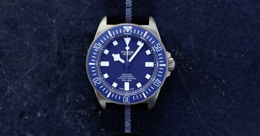
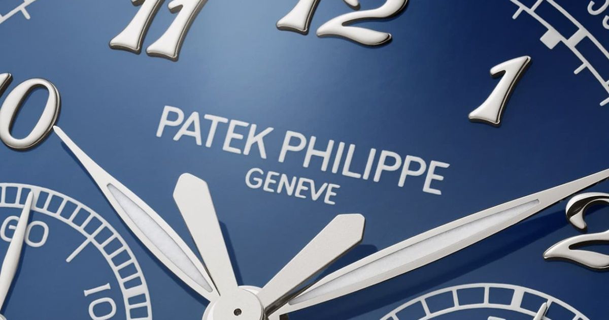
Then there’s the typography. The font of the numerals—whether it’s the elegant Breguet numerals, the robust Arabic numerals of a pilot’s watch, or the minimalist baton indices of a dress piece—imparts immediate character. The “Railroad” minute track, the pulsometer scale, the tachymeter bezel printed on the dial periphery: these are not decorations; they are tools, speaking directly to the watch’s intended purpose.
Textures & Finishes: The Language of Light
This is where the dial truly sings. Master craftsmen use techniques often passed down through generations to manipulate light in mesmerizing ways.
- Guilloché: Engine-turned patterns created by a rose engine or straight-line machine. Waves (clous de Paris), sunrays, barleycorn—each pattern catches light differently, creating a dynamic, living surface. Done by hand, it is a testament to human artistry.
- Enamel: The holy grail of dial arts. Grand Feu enamel involves firing powdered glass at extreme temperatures multiple times on a metal base. The result is a deep, vitreous, incredibly durable surface with a warmth no print can replicate. Variations like cloisonné (wires defining areas) and champlevé (cells carved into the metal) are miniature paintings.
- Lacquer: Especially Urushi, a Japanese lacquer from tree sap, applied in countless layers, each polished to perfection. It achieves a profound, organic depth and richness.
- Graining: Techniques like perlage (circular graining) or Côtes de Genève (Geneva stripes) are often seen on movements, but when transferred to the dial, they create a subtle, technical texture.
- Simple Elegance: Don’t underestimate a perfect matte, grained, or sunray-brushed finish. They provide the perfect, legible backdrop for a watch meant to be a tool or an understated companion.
The Luminous Element: Painting with Time
Lume transforms a dial from a daytime accessory to a 24-hour instrument. Super-LumiNova, a modern photoluminescent material, has largely replaced radioactive tritium. Its application is an art. It can be painted on, filled into recesses (lume plots), or formed into blocks. The colour of the lume in daylight (often cream or white) and its emission (typically green or blue) adds another layer of aesthetic choice. A perfectly aged patina on vintage lume (tropical lume) tells a story of decades passed under the sun.
The Psychology of the Dial: The Silent Communicator
Within a second of glancing at a watch, the dial tells you what it is. A stark, black dial with large white indices? It’s likely a tool or sports watch. A textured, gilt dial with antique-style fonts? It leans vintage or heritage. A minimalist dial with nothing but two hands? It’s a statement of pure, horological essence.
The dial also manages space and perception. A “fumé” or gradient dial, dark at the edges and light in the centre, draws the eye inward and creates a sense of depth. A chapter ring can frame the display. The placement of sub-dials (symmetrical vs. asymmetrical) defines a chronograph’s personality. The use of negative space is as powerful as the use of detail.
Conclusion: The Interface of Desire
When you choose a watch, you are fundamentally choosing a dial. It is the interface through which you connect with the machine. The movement is the genius inside, but the dial is its voice, its expression, and its face to the world.
It is a multi-layered artefact: part engineer’s blueprint, part artist’s canvas, part historian’s document. It can be read like a map, admired like a painting, and relied upon like a compass.
So, the next time you admire a timepiece, pause. Look beyond the brand and the case. Study the dial. Ask yourself: What is its base? How was its texture achieved? How does the light play on it? How does it tell me the time? In that detailed observation, you’ll discover that the dial is, indeed, infinitely more than just a pretty face. It is the story, the purpose, and the spirit of the watch itself.